Kinésiologie
business card | Apr 9, 2012
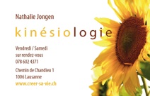
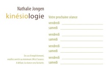
While training for certification as a kinesiologist, Nathalie Jongen is already able to begin working with clients. She felt the image of a sunflower would communicate her therapeutic approach. Nathalie had taken an exquisite photograph that seemed perfect for the card. Silhouetting a couple of flowers from a full field keeps the layout simple, and easier to read. Breaking the word kinésiologie into two distinct parts plays on the idea of equilibrium. The colors used for the text were sampled directly from the image. The resulting design is coherent, sunny and light.
“Sue successfully translated what I wanted to convey with my business card,
using a balanced mix of colors, shapes and images. Collaborating with her
was easy and straightforward.”
Nathalie Jongen
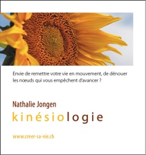
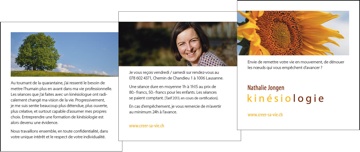
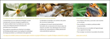
brochure | Jun 11, 2013
After a successful year of practice and continued training, Nathalie was ready to add a brochure to her promotional tools. We decided on a small trim, 30 x 10.5 cm—horizontal half of an A4 sheet—folded into thirds using a z-fold. This way, the brochure has a continuous, flowing feel to the reader, which is in keeping with Nathalie’s goals as a kinesiologist, helping clients achieve better energy flow.
business card - front
business card - back
brochure - front
brochure - folded
brochure - flat