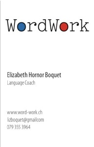
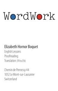
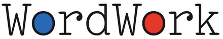
WordWork
logotype / business card / web banner
Elizabeth Hornor Boquet’s professional skills blend English language coaching, private lessons, translation, and proofreading. She wanted a logo treatment for her recently rebranded business. I quickly knew I wanted typewriter-inspired letterforms for WordWork. Finding the right one was tricky. There are plenty of typewriter-ish fonts available, but many of them were flawed to my eye. Either the uppercase W looked too spikey, or the lowercase r looked too stunted. The winning typeface had wonderful r’s, but the W’s needed altering—the middle peaks sitting at the same level as the serifs didn’t look right. Dropping the peaks to the same level as the letter bodies looked more balanced and more visually consistent.
The reds and blues in the American and French flags represents Liz’s facility moving between the two languages. Filling the center of the o’s with color expresses Liz’s playful approach to language learning.
To truly get a feel for Liz’s WordWork, visit her site
Jul 2, 2012