Rio Bees
logotype / logomark / label design
Back in March I got an email from Taylor Horst, a former UNM Press colleague. Taylor and I hadn’t been in touch for over ten years. In fact, he didn’t know I’d moved to Switzerland. The subject line of his message read “OK, OK, I know it’s been a long time . . .” and continued “I need HELP! I’m now a beekeeper, my bee business is expanding, and I need a BRAND. A LOGO. LABELS for jars. A better BUSINESS CARD. So can I buy you lunch or a cup of coffee sometime next week, and show you my ideas, and pay you honey . . . er, money to get me looking good graphically? I sure hope so!”
This is one of the wonderful things about the internet! I couldn’t meet Taylor for coffee, but I could easily and happily do his design work!
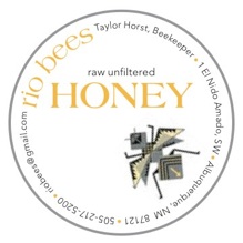
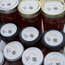
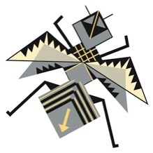
Taylor scanned and sent me some bees he’d doodled and some photos of New Mexican pueblo style pottery, which served as references for the bee that became his logomark. He wanted labels for the lids of his honey jars, leaving the beautiful honey inside completely visible through the glass. I created a TIFF for Taylor to insert into an Avery label template, and he produced the label sheets with his own printer. There’s space on the label for Taylor to write the blend and weight, and the round format can also be used for other products, like comb honey packed in clear plastic tubs.
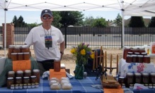
These photos were taken at his first farmers market of the season, up near Albuquerque Academy in the northeast heights.
Reconnecting with Taylor, and working on this project has been such a total blast! I look forward to bringing jars of Rio Bees honey back to Switzerland after visiting with family in the US this summer.
These closing words from Taylor: “Thank you so much! I feel like a professional retail operation now! Amazing what some good design and a little bit of execution will do!”
Fast technology in service of slow food.
And friendship.
Jun 1, 2012